Aren't we confident enough in the GLX happening that they could put the new branches on as a "dashed line" at this point?
Railroad Forums
Sign, sign, everywhere a sign ...
- Discussion relating to commuter rail, light rail, and subway operations of the MBTA.
Nah, the GLX wont be reflected on the maps until at least 10 years after it has been completed 
Realistically, we are years away from any GLX openings. Even the Lechmere relocation isn't making any significant headway at this time.
It seems the new route for maps is to just print giant sticker maps. If they were actually printing those big vinyl-on-metal maps, they could print GLX on it and maybe blank it out with a white sticker, then peel the sticker off to reveal GLX when the time comes.
It seems the new route for maps is to just print giant sticker maps. If they were actually printing those big vinyl-on-metal maps, they could print GLX on it and maybe blank it out with a white sticker, then peel the sticker off to reveal GLX when the time comes.
|| REGIONALRAIL ||
ceo wrote:Second map labels all the stations, however, which is far more important.Geographic accuracy in a system map is of the utmost importance. Line specific schematic maps show order of stations, which is why the two always accompany each-other. Making a map disproportionate to show detail defeats the purpose of having a system map in the first place.
Moderator: Massachusetts Bay Transportation Authority, Brightline Trains
Avatar:3679A (since wrecked)/3623B (now in service as 3636B).
Avatar:3679A (since wrecked)/3623B (now in service as 3636B).
Perfect geographic accuracy is not necessary - it's okay to have a little distortion - but thing being approximately the right direction relative to each other is important. This map utterly fails that. Many of the issues are because the original design was by a non-native, and the MBTA failed to correct them:
- The GL branches - particularly C and D - are substantially distorted from their actual shapes. They took the perfectly straight C Branch and made it curved!
- The 77 is wrong - it runs southwest of Davis, but northeast of Alewife.
- Union Square Allston and Harvard Square are pretty close to north-south - not east-west as the map depicts
- The Worcester Line is shown wrongly in relation to the B Branch, as noted before. It also runs north of Prudential, not south of Symphony as shown.
- Blue Hill Avenue station - opening next year - is not shown. Several of the other Fairmount stops are not near their real locations.
- Readville is poorly drawn, so it looks like Franklin trains run on the Fairmount rather than the NEC
- All the other water is drawn in, but the Saugus River is missing
- The 66 is shown crossing the E Branch, while it actually parallels it from Riverway to Brigham Circle
- 27 Drydock Ave stop is flat-out missing
- The Green Line is incorrectly shown crossing the Orange Line
- Massachusetts Avenue and the 1 bend in completely different ways south of Central than is shown
- The 32 runs on the other side of the NEC - an important distinction when there are few ways to cross it
- Orient Heights is north of Belle Isle Inlet, not next to it
I think some of those are nits, and not really relevant for someone just trying to get from station A to station B and needing to know which route(s) to take. Readability is more important. I'd bet that if you took a geographically accurate map and this map, and put them side by side, most people would find this map more useful.
- If I'm at Dudley Square and need to get to Union Square, the important information is that I should take the 66 bus, not where the 66 crosses the E line.
- If I need to get to BC from downtown, I need to take the B line, but I don't care that it's straight instead of curved.
- There are no stops between Haymarket and North Station, so it doesn't matter how the lines are drawn between them (within reason).
People aren't going from one station to another, they're going from one point to another. Someone already mentioned the significance in demonstrating the proximity of Reservoir, Cleveland Circle, and Chestnut Hill Ave., without it someone might think they could walk from Chestnut Hill Ave. to Chestnut Hill as easily as you can walk from Longwood to Longwood Medical Area. It is with good reason that street maps show separate detail sections for congested areas, and don't just distort maps to fit dense areas. If you're going to include geographic features (like the ocean, harbor, rivers, Castle Island, etc.) to give a reference to where you actually are, then you're providing a geographic map, not a schematic one. The current map is misleading and disgraceful. The map preceding it was far superior. If you want to see a green line order of stations map, look at one.
The 66/E Line is another perfect example, it isn't even schematically correct. If I were relying on just the map, I'd have no idea that I could transfer between the two at 4 different stations (and Brigham Circle is the worst of them).
The 66/E Line is another perfect example, it isn't even schematically correct. If I were relying on just the map, I'd have no idea that I could transfer between the two at 4 different stations (and Brigham Circle is the worst of them).
Moderator: Massachusetts Bay Transportation Authority, Brightline Trains
Avatar:3679A (since wrecked)/3623B (now in service as 3636B).
Avatar:3679A (since wrecked)/3623B (now in service as 3636B).
Here's one for Yellowspoon  Yes, this is one of those new maps.
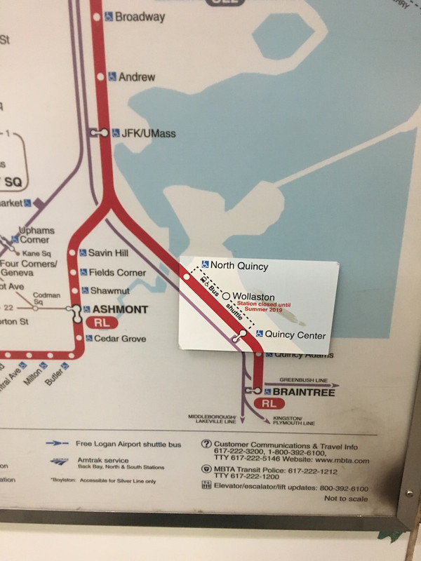
The sticker isn't on the map, it's on the plastic cover, which sits about half an inch off the map, so it looks odd unless you're at eye level with it at 4 feet off the floor.
The sticker isn't on the map, it's on the plastic cover, which sits about half an inch off the map, so it looks odd unless you're at eye level with it at 4 feet off the floor.
I would assume that electronic display signs on commuter rail trains count as a sign.
This morning, I noticed on a inbound train that the message for "Now Arriving at River Works" was spelled incorrectly as "RIVER WOEKS". It was spelt correctly in the Now Approaching and This Stop is "River Works" Messages.
This morning, I noticed on a inbound train that the message for "Now Arriving at River Works" was spelled incorrectly as "RIVER WOEKS". It was spelt correctly in the Now Approaching and This Stop is "River Works" Messages.
Going back up a page or so, I note that the new map also shows the Lowell Line and the Green Line north of North Station parallel to each other. This is undoubtedly to make it easier to add the GLX to the map when the time comes.
Who is the target audience?
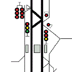
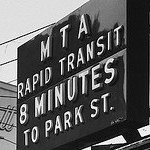
Here is a sign on the Red Line at Downtown Crossing. There is one on the northbound platform and one on the southbound platform. Who is it for? If one is arriving from Ashmont, the sign is useless because the correct action is to take the train one more stop to Park Street. If one is arriving on a train from Harvard, then the correct action was to get off at the previous stop. If one has walked to this point from the station entrance, one is going to have to walk back the way they came to get to the green line. So my question is ... Is there anyone for which this sign has any value?
 RDCR140821_2025567_WhatsThePoint.jpg (21.88 KiB) Viewed 5289 times
In the second sign, what does "STATE" mean? Is it a verb? How is a tourist supposed to know that this is an MBTA entrance? I know it's the name of the station only because I've lived here for 70+ years. Does this lead to both the Orange and Blue line? Or does it lead only to the Orange Line (and if I want the Blue Line, I'm supposed to go to the right).
RDCR140821_2025567_WhatsThePoint.jpg (21.88 KiB) Viewed 5289 times
In the second sign, what does "STATE" mean? Is it a verb? How is a tourist supposed to know that this is an MBTA entrance? I know it's the name of the station only because I've lived here for 70+ years. Does this lead to both the Orange and Blue line? Or does it lead only to the Orange Line (and if I want the Blue Line, I'm supposed to go to the right).
 OSTA_1711_7_2021_Unknown.jpg (34.45 KiB) Viewed 5289 times
Here is a sign on the Red Line at Downtown Crossing. There is one on the northbound platform and one on the southbound platform. Who is it for? If one is arriving from Ashmont, the sign is useless because the correct action is to take the train one more stop to Park Street. If one is arriving on a train from Harvard, then the correct action was to get off at the previous stop. If one has walked to this point from the station entrance, one is going to have to walk back the way they came to get to the green line. So my question is ... Is there anyone for which this sign has any value?
Yellowspoon wrote:How is a tourist supposed to know that this is an MBTA entrance?Well, the big (T) sign out front is a hint, as is "To Trains". Every city's transit system looks different, and when you visit a new city it's one of the first things to figure out.
Yellowspoon wrote:Who is the target audience? Here is a sign on the Red Line at Downtown Crossing. There is one on the northbound platform and one on the southbound platform. Who is it for?Those were added during the 2004 DNC as well as the different colored panels on the station signs at other transfer stations (ie the green panels at Park Street Under). It's simply to demonstrate that you can transfer to the green line from Downtown Crossing. Why would you? You want to get to the Green Line from DTX and the station is packed, or every train that comes in is loaded beyond capacity. Perhaps there's a delay and you don't want to wait for the train when the walk through the concourse would be shorter. Maybe you got off a stop early by mistake and the next train is 15 mins away, or, maybe you missed Park Street on the southbound. There are plenty of reasons why you could be on those platforms and would be better served by the Winter Street concourse than the train. Signage pointing out all of your options isn't a bad thing.
Yellowspoon wrote:In the second sign, what does "STATE" mean? Is it a verb? How is a tourist supposed to know that this is an MBTA entrance? I know it's the name of the station only because I've lived here for 70+ years. Does this lead to both the Orange and Blue line? Or does it lead only to the Orange Line (and if I want the Blue Line, I'm supposed to go to the right).I think you're looking for problems where they don't exist. While I'd agree that "State" should be "State Street," the sign conforms to the Cambridge 7 standard and therefor conveys the appropriate information. How is a tourist to know that a stairway with a bunch of letters and numbers with circles behind them is a subway station? Well, if you walk around Manhattan for 5 minutes you get the hint pretty quickly. Not every station sign needs to say "This passageway is an entrance that will bring you to the MBTA's State Street subway station, it serves the Blue Line and the Orange Line."
Moderator: Massachusetts Bay Transportation Authority, Brightline Trains
Avatar:3679A (since wrecked)/3623B (now in service as 3636B).
Avatar:3679A (since wrecked)/3623B (now in service as 3636B).
If you think that STATE sign is confusing, 60 years ago it probably would have said "State/Milk - Trains to Forest Hills/Everett" on the left and "Devonshire - trains to East Boston and Revere" on the right. Quite a lot for that tourist to take in. 
Jon
Jon
Courage is not the absence of fear; it is the determination that some things are more important than fear.