• MEC 506

  • Guilford Rail System changed its name to Pan Am Railways in 2006. Discussion relating to the current operations of the Boston & Maine, the Maine Central, and the Springfield Terminal railroads (as well as the Delaware & Hudson while it was under Guilford control until 1988). Official site can be found here: PANAMRAILWAYS.COM.
Guilford Rail System changed its name to Pan Am Railways in 2006. Discussion relating to the current operations of the Boston & Maine, the Maine Central, and the Springfield Terminal railroads (as well as the Delaware & Hudson while it was under Guilford control until 1988). Official site can be found here: PANAMRAILWAYS.COM.

Moderator: MEC407

  by MEC407
 
Definitely a darker blue than I had imagined. Kind of similar to CSX's current blue.

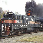
I don't love it... but I don't hate it either. I would dare say that it's a pretty accurate representation of the Pan American Airways brand from the early days of the company. The logo, the lettering, and the color are very, very similar to what was found on Pan Am's "flying clippers" of the 1940s and 1950s.

Take a look at these photo of the Pan Am Clipper "Flying Cloud" which currently resides in the Smithsonian:

http://cdn-www.airliners.net/aviation-p ... 708628.jpg

http://cdn-www.airliners.net/aviation-p ... 393499.jpg

The logo and lettering look black in the photos, but I've seen this plane in person and I can assure you that it's a dark royal blue, very similar to the paint on the MEC 506.

The similarities with the logo and lettering are obvious.

If we think of this unit as a "heritage unit" meant to honor the early days of Pan Am, it actually makes a lot of sense in that context.

Having said that, the nose still looks too boring to me, and they could have done some other things to dress it up a bit... silver trucks would have been perfect... but considering that this is the most frugal railroad on earth, it's amazing that they paint their locomotives at all, rather than just running them in primer.

  by cpf354
 
QB 52.32 wrote:
bwparker1 wrote:This is dumb question, but I honestly don't know the answer... Where did the Guilford Name originate?

BWP

PS that is a pretty bad paint scheme... :(
I believe it is named after Guilford, CT, where the Fink/Mellon enterprise began with a tie treating company by the same name.
That is true.
The word "Guilford" is almost entirely stricken from the corporate letterheads. The only remnant is Guilford Motor Express, which runs the Ayer intermodal ramp, and it's commonly known as GMX. The only reason people still insist on calling the thing Guilford is that all but 3 of their locomotives and just about every piece of MOW equipment and trucks still carry the Big G!
As for the paint scheme, I think it's handsome, but rather dull to photograph.

  by mick
 
Permatreat
Last edited by mick on Mon May 05, 2008 3:18 pm, edited 1 time in total.

  by mc367
 
MEC407 wrote:\.. but considering that this is the most frugal railroad on earth, it's amazing that they paint their locomotives at all, rather than just running them in primer.
They already do, just with a touch of orange.

-Justin

  by bwparker1
 
Thank you for the replies on Guilford's name origin.

BWP

  by NV290
 
GP40MC 1116 wrote:2 New Paint Schemes in less than 5 years.....Stupid Idea to me
2 in 5 years is really not that big of a deal. Have you forgotten BNSF? They have had about 10 paint scheme changes in the past decade.

  by newpylong
 
That is one terrible paint scheme.

  by MEC407
 
Over on the Blahoo groups, lots of people are saying that it reminds them of the NS paint scheme. Maybe it's just me but I can't see any resemblance at all. If anything, it bears more of a similarity to CSX... slap some yellow paint on the nose and the rear and there you have it, instant CSX.

  by Dave C
 
MEC407 wrote:Over on the Blahoo groups, lots of people are saying that it reminds them of the NS paint scheme. Maybe it's just me but I can't see any resemblance at all. If anything, it bears more of a similarity to CSX... slap some yellow paint on the nose and the rear and there you have it, instant CSX.
As an ex Maine-ah, now living in CSX/NS country, there's nothing about it that says Norfolk Southern. I'll agree on the CSX part.

For the love of goodness bring back the grey and orange:)

  by MEC407
 
Come to think of it, it's not dramatically different than the paint scheme found on Florida East Coast's GP40-2s:

http://www.railpictures.net/images/d1/1 ... 696644.jpg

  by GRSGuy
 
Ooh Ooh Ooh! FEC bought out Pan Am! Now thats juicy!

  by b&m 1566
 
GRSGuy wrote:Ooh Ooh Ooh! FEC bought out Pan Am! Now thats juicy!
LOL don't get your hopes up!!! (Come to think of it, didn’t the original Pan Am Company originate in Florida?)
I like the font style but if they had a wing design or something on the front of the engine it might look a little bit better.

  by MEC407
 
God, we could only hope in our wildest dreams for FEC to buy out Pan Am... that's a company that really knows how to run a railroad. Our own Noel Weaver can attest to that.

Here is another shot of the newly-painted 506, this time from the engineer's side:

http://rrpicturearchives.net/showPictur ... id=1147932

The wind-swept lettering is definitely a nod to the early Pan American Flying Clippers. Would've been nice if the "506" under the window was in the same typeface as the road name... seeing it in such a dramatically different typeface almost makes it look like a patch job.

It won't be winning any awards for "best heritage-inspired paint scheme" -- UP's Heritage Fleet still takes the cake for that -- but it's not a bad effort... especially considering that it was probably designed by someone who is not a graphic artist.

  by NV290
 
I actually like the new paint. The color, simplicity and logo design is classy. Worlds better then that (in my opinion) hideous shade of blue and charcoal scheme with a different logo on each side. And while the charcoal and orange livery was not that bad, it certainly is old. I guess PAR is trying to freshen things up a bit. Even UP has made changes to it's paint scheme to modernize it.

I personally did not care for the use of the Pan Am airlines logo and font on their "railroad". It just seemed too out of place. At least with the new font and style, only the name remains similar.

I still think they need some sort of a nose herald.

  by b&m 1566
 
MEC407 wrote:The wind-swept lettering is definitely a nod to the early Pan American Flying Clippers. Would've been nice if the "506" under the window was in the same typeface as the road name... seeing it in such a dramatically different typeface almost makes it look like a patch job.

It won't be winning any awards for "best heritage-inspired paint scheme" -- UP's Heritage Fleet still takes the cake for that -- but it's not a bad effort... especially considering that it was probably designed by Mr. Mellon himself, who (to my knowledge) is not a graphic artist. :wink:
Yeah there we go!!! It's a heritage paint scheme! LOL
I was also thinking the same thing; the numbers under the cab should have had the same style font. If it didn't have the globe and wings it would look even better, or at least modernizes it, you can tell it’s a logo drawing form the mid 1900’s. A nice wing design or something going across the nose and ending under the cab on each side would be nice (maybe), though I bet Union Pacific would have an issue.