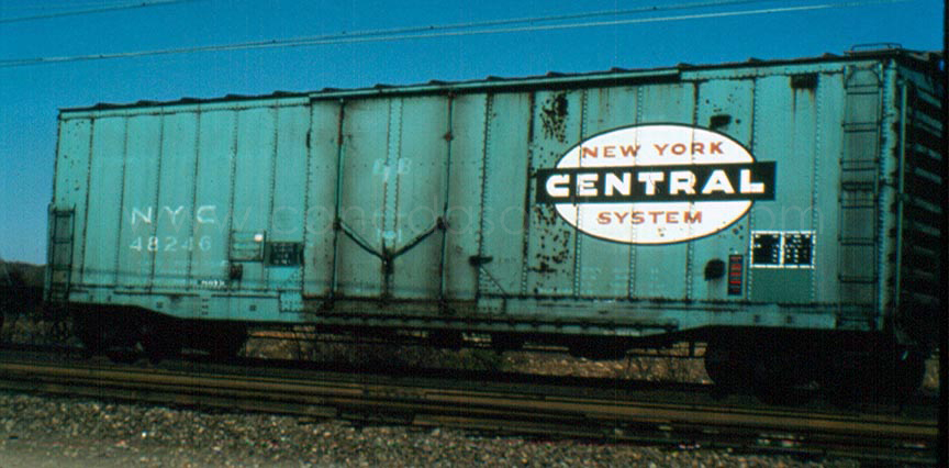
I would guess that the Gothic lettering is The NYC's own font and not a standard type. The excerpt below from the 1994-4th qtr NYC
Headlight lists drawing numbers of fonts that may or may not be available from the NYCS Historical Society.
http://www.nycshs.org/index.html
Question 335: When did New York Central adopt the Gothic (sans serif) lettering style?
Answer: The initial alphabet and numeral drawings (number series 51900-51924) in the Gothic style were prepared in June and July 1939, and the initial lettering diagrams (number series 51925-51941) were prepared in the June-October period of the same year. The diagrams covered coaches, baggage, milk, express refrigerator, combination passenger-baggage, business, baggage-mail and multiple unit cars. Alphabet drawings for locomotives followed, and were prepared in January 1940. The drawings for locomotive numerals were common with the car style. Lettering diagrams in the Gothic style for steam locomotives were prepared in January 1940. Purists should note that each size of letter has a slightly different form, that is, an 8-inch letter is not simply 1.6 times the size of a 5-inch letter. Further, in the case of the 5-inch and 8-inch locomotive alphabets, the forms of letters A, B, C, D, E, H, M, 0, R, S, Y and & were adjusted in January 1947

