by WesternNation
We can all agree that Amtrak has its problems; from OTP to old equipment, it’s continually an uphill battle to improve and develop America’s primary passenger rail carrier. Conservative factions continue to call for Amtrak’s defunding while others call for spinning routes off to private operators, ignoring the boondoggle that is the passenger rail system in the UK. However, there is one rather basic problem that Amtrak has encountered in the last 10-15 years that continually gets overlooked: Amtrak has a branding issue. This post (or article, depending on length), is designed to identify and address each segment of this issue, as much as one can from an “outsider” perspective (meaning, I’m not an employee, so I do not have access to Amtrak uniform programs, catalogs, or reasoning behind branding decisions).
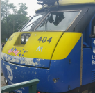
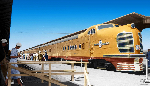
Rolling Stock Livery: There are currently 8 different liveries in use on Amtrak (Phase III, Phase IVb, Phase V, PacSurf, CapCor, Cascades, and Downeaster), with the most recent being IVb in 2002 and the refreshed Phase III popping up on the new Viewliner II series cars. All of these different liveries creates a branding issue as well as an inconsistent image when equipment must be swapped out. A prominent example of this is found in California, when “National Network” Superliner coaches are added to the Pacific Surfliner and Capitol Corridor trains. Another example is basically every long-distance service in the country. The new Viewliner II cars were delivered in Phase III paint with the branding of “Amtrak America”. No action has been taken to enact this rebranding system-wide, and as a result, the mixed branding on the equipment harks back to Amtrak’s “Rainbow Era”. While it may be desirable for each service to have its unique branding, it will likely cost more in the long run and degrade the overall unified brand. For new rolling stock, an LED information screen (like the ones found on the front of the SC-44) on the sides of each car identifying the train with train number, service name, and final destination, will assist passengers while maintaining the professional look of a unified brand. Understandably, some services may have branding standards within the operating contracts, which may prevent all services from having a unified image.
Frontline Employee Uniforms: Amtrak’s most recognizable employees are those who interact with passengers every single day. As a result, a professional and unique image for the frontline employees is a must-have. However, Amtrak’s Uniform Program seems to have fallen short in doing so, providing uniforms to Train Service and OBS employees that are similar in nature which (from what I have personally witnessed) passengers can easily confuse, especially if Conductors remove their cover on board. Additionally, I have seen many conductors (especially in warmer environments) not wearing their jackets, which increases the chance of passengers to confuse OBS personnel for Conductors and vice versa. Recently, Station Service employees have started wearing light blue polos with navy blue lettering, which appears to be a “cop-out” for a proper uniform that one would be proud to wear. Amtrak should return to the use of colored epaulets to denote craft, maintaining the white or teal on navy blue for Conductors and Assistant Conductors, Red for the Red Caps (while reinstating the red variant of the conductor's cover, not the ballcaps in use now), yellow for the Engineers, and navy on teal for the Station Services agents. These uniforms provide a consistent, yet unique appearance clearly identifying the various employee workgroups to both internal and external stakeholders as well as giving the entire frontline employee force a clean, professional look.
Amtrak has a branding and image problem. If the company is to be taken serious both in the eyes of the general public and in the halls of both state and federal governments, a concerted effort is needed to unify the Amtrak brand and image of their employees. While this would certainly cost a significant amount of money, it would be one of the “easier” things for Amtrak to accomplish, as new services, new equipment, and large capital projects are largely dependent on outside funding (via the annual subsidy from the federal government), but it would do much to increase the look of professionalism and overall “togetherness” of the railroad.
Do you agree? What ideas do you have for Amtrak's brand image?
Amtrak Logo and Branding Guide (PDF Download):
https://history.amtrak.com/archives/amt ... 2-8-19.pdf
Amtrak Uniform Blog Post:
http://blog.amtrak.com/2014/01/amtrak-uniform/
2014 Amtrak Uniform Post:
https://history.amtrak.com/archives/onb ... forms-2014
2006 OBS, Transport, and Station Service Employee Uniform Post:
https://history.amtrak.com/archives/on- ... forms-2006