by PatrickTrains
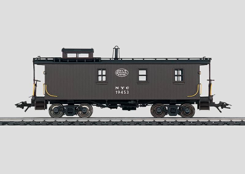
As is likely with many of you I eagerly awaited the release of the Trix 19000 Series NYC caboose. After reading Terry Thompson’s review in the February 2005 issue of Model Railroader (pgs 28-29, and pg 104) I decided to take a more thorough look at this model to see if further improvements can be made. Here’s what I’ve found to date:
- In the second paragraph of page 28 of the Model Railroader review you’re led to believe that the smokestack as supplied on the model is too high. On page 94 of the NYC Color Guide to Freight and Passenger Equipment (Color Guide) the topmost photo shows at least one instance were this height appears correct. I do agree that the vast majority of photos show a much shorter height, and I have to believe that a caboose operating East of Buffalo, NY prior to the clearance improvement project of 1963 would have the shorter smokestack.
- No mention is made in the Model Railroader reviews of the smokestack’s color. From the color photos at my disposal it most often appears as if the smokestack is galvanized metal that is weathered to a combination of rust and soot. See the photos on pages 94-95 of the Color Guide. I believe that painting the smokestack silver and then weathering it would yield a much more realistic model.
- Based on the photos it seems that most of the cars didn’t have black roofs as a result of the Roof Cement treatment. On those that do, the black color ends at the roof edge. The Trix model carries the black over the side and eaves.
- Prototype photos show that the lighter Red Oxide, not the Tuscan Red of the model, seems to be the more common paint scheme.
- The grab irons on the cupola roof and on the ends next to the doors/steps should have a supporting piece at each mid-point 90 degree bend. From the photos it appears as if an EMD-style lift ring at each bend would correct this problem.
- The Model Railroader review leads you to believe that the short grab irons installed adjacent to the doors on each end must be vertical. A review of the photo on the lower left of page 26 of the book Cabooses of the New Haven and New York Central Railroads (NH/NYC Cabooses) shows an instance where the horizontal installation is correct. You’ll also note that this car has the later (non-mitered) running board configuration. Further, these grabs irons appear to be too long. The photos and diagrams show them to be considerably shorter than what Trix models.
- On page 28 of the Model Railroader reviews Terry Thompson leads you to believe that the Eastern Car Works Barber-Bettendorf trucks are a correct replacement for supplied ones. Based on the picture I have of these trucks I would say that this is not a good match for the NYC’s caboose truck as the shape of the frame around the leaf springs is way too flat; it needs to be much more round. I do agree that the Eastern Car works product is a lot closer than what Trix supplied. I’ve been unable to find any truck that is a good match.
- The Model Railroader review correctly states that the garb irons are located too far from the car side. What they don’t do is indicate that many are also located too far from the car ends. A review of the scale drawing in the April 2004 issue of Model Railroader (pgs 68-71) clearly shows this error.
- I heartily agree with Model Railroader review in that the articulated coupling system as supplied by Trix should be eliminated. Why Trix spent development and production money on this feature for such a short car is completely beyond my comprehension. I especially find this choice objectionable given the model’s poor underbody detail.
- The drop grabs on the end sills are the wrong shape. They should come out horizontally and then bend 90 degrees down. The Trix grabs are vertical and then bend 90 degrees horizontally. The photos on page 26 of the NH/NYC Cabooses book clearly shows the correct arrangement, as do those on pages 94-95 of the Color Guide.
- The Model Railroader review correctly states that the windows on the side of the cupola are too narrow; by this they mean not the correct height. From the photos and diagrams they should have the same height as the windows on the front and rear of the cupola. One thing the Model railroader article doesn’t mention is the rain gutter over the top of the side windows is the reason they are too narrow. As far as I can tell this rain gutter is not on the prototype and should be removed from the model. The windows can then be enlarged to the correct height. You’ll have to replace the clear inserts if you enlarge the windows.
- The end rail grab rails have an incorrect paint scheme. The yellow should be carried up on the horizontal section to the first vertical post. The model I have is missing the paint on these handrails entirely. The photo in the Model Railroader review also depicts an incorrect paint scheme.
- The bolt detail is entirely missing from the end beams.
- The strap that supports the end of the brake staff under the end beam is missing.
- The roof mounted grab irons that should be on the running boards just inside of each ladder are missing.
- The running board on each side of the cupola is only one board wide. It should be two boards wide and come out to the roof edge.
- The underbody detail on this model is dreadful. Photos clearly show the Triple valve, air cylinder, and air reservoir, but almost none of this is represented on the model, and what is there is incorrectly located (At least for an AB-equipped car). I’m not familiar with the brake rigging on a K-equipped car so I can’t offer a critique in this light.
- The king posts that support the truss rods are woefully over size and have the wrong shape.
- No representation is made of the steel I-beams that run across the car and that many (All?) rebuilds received. On the photos these show very prominently.
- The plate that acts as a support for the triple valve on the B-A side of the car is not represented.
- The reinforcing plates on each bottom corner of the car are too small. They need to be about twice as high as modeled. On these same plates the poling pocket that should be on each end is not represented.
Please be aware that the above comments aren’t meant to imply that the Trix model is terrible. It is way better than what we had previously (nothing at all or an expensive brass model). Rather, I hope that these comments will allow us to take this model and improve it where desired. If anyone notes other errors in this model or in my comments I encourage you to bring them to our attention. The goal is to make as good a representation as possible, and this starts with being aware of what needs to be done

