Railroad Forums 

  • Some one's been busy-New layout

  • General discussion about the RAILROAD.NET site, forums, or content ONLY. Please do not post your general railroading questions, please choose an appropriate forum. For help using the site, please post in the Help Using RAILROAD.NET Forum.
General discussion about the RAILROAD.NET site, forums, or content ONLY. Please do not post your general railroading questions, please choose an appropriate forum. For help using the site, please post in the Help Using RAILROAD.NET Forum.

Moderator: Jeff Smith

 #347168  by Brad Smith
 
I personally like the new layout, it seems to 'flow' better.
Last edited by Brad Smith on Fri Jan 12, 2007 9:35 am, edited 1 time in total.

 #347203  by Noel Weaver
 
So do I, it is easier to use. Good job guys!!!
Noel Weaver
 #347226  by Ken V
 
Well, I suppose it is an improvement. I had gotten used to the previous format and got around pretty well with it. I'll get used to this one too, unless it changes again before then.

 #347237  by keeper1616
 
now all the forums i visit are at the bottom :(

 #347239  by git a holt to it
 
I think the employment section shoul be back towards the top.

 #347381  by UPRR engineer
 
SWEET.......

 #347400  by stilson4283
 
How about:

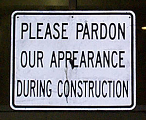
Please Pardon Our Digital Dust

Or similar to the signs on the NYS thruway:

Construction Ahead
Your Donation Dollars at Work

Chris

 #347421  by umtrr-author
 
As long as it's not:

"The improvement is temporary
The inconvenience is permanent"

As some wag once posted near a perpetual construction site many years ago...
:wink:

 #347431  by pgengler
 
Best roadway sign ever: "Sign under construction".

I have two thoughts (one positive, one negative), and while I understand that it's still a work in progress, better to get these out while things are still in flux.

Act I, wherein I render praise: I like that the actual railroad forums appear near the top. I'm sure it looks better to a new visitor see that the railroad forums are near the top, with the Amtrak forum just peeking up "above the fold" on my laptop (1024x768 res.).

Act II, whereupon we find out hero mumbling quietly in the corner: I don't really like that the "Active Railroads" category (a misnomer, really) is immediately followed by the "Fallen Flags", with the "Short Lines & Industrials" behind that and "Commuter & Transit" in a distant third. For one thing, it breaks up all the active ones by including fallen flags in the middle, but mostly it pushes the second, third, and fourth busiest forums (NJT, LIRR, MBTA) further down. I'd suggest putting the "Commuter & Transit" category right after "Active Railroads", then then you're best judgment about whether "Fallen Flags" or "Short Lines & Industrials" comes next.

[Intermission]

 #347620  by RearOfSignal
 
Yeah, I think the fallen flags should be a little lower, it would be nice if the Commuter & Transit section could follow the Active Railroads section, then maybe the shortlines, then the Fallen flags. The most used forums should be towards the top. :wink:

 #347685  by RearOfSignal
 
Otto Vondrak wrote:Forums are NOT ordered based on popularity.
I didn't mean that the forums should be listed by their popularity. But I don't think that having Fallen flags ahead of the Commuter & Transit and the General Operations down at the very bottom works well. Unless by moving them around you're trying to promote activity in seldom used forums or ones that people may not have noticed, hoping that this will lead to less off-topic threads?

Can you please explain the reason for the change in layout? :-) (Yes Otto I used an emoticon ) :-D :-D

 #347741  by Brad Smith
 
Everything is relative. What's important to one person is often irrelevant to another and vice versa. For example, I always go to the fallen flag forums and have never stopped at any of the commuter sites, and I know I'm not the only one.