Railroad Forums 

Discussion relating to the operations of MTA MetroNorth Railroad including west of Hudson operations and discussion of CtDOT sponsored rail operations such as Shore Line East and the Springfield to New Haven Hartford Line

Moderators: GirlOnTheTrain, nomis, FL9AC, Jeff Smith

 #1468865  by Backshophoss
 
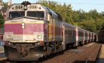
I remember what Joe went thru to get the first 4 Fl-9's painted,with help from the New Haven Tech and Historical group,
creating the materials and templates needed including the paint color codes from Dupont.
At a public meeting about the Danbury Branch in Danbury there was stiil a discussion of rebuilding some of the then stored 8600 class EMU's
as coaches for the 2 thru trains on the branch,BBD reps made a presentation of the Comet II design,then in production For NJT at that hearing.
The 8600's were still complete,with the PCB loaded Main Transformers,back then it was a major nightmare to dispose of them.
Later ConnDOT went with the BBD Comet II's/Shoreliner I's. The red used on the cars was the same red used by then PC/CR on the M-2's.
 #1469890  by mapper63
 
Thanks for the background guys. Back in 93 on the FL9M program I was told we were using that livery because it’s the only one we already had and wouldn’t need to reinvent the wheel. Now I know where it came from, and the puzzle is complete.
 #1469945  by Backshophoss
 
They were all stored at East Bridgeport yard as the M-2's went online,as "rebuild fodder" at that time.
Years later,a few select cars were made usable to work "off peak" service on the New Canaan Branch,
as the M-2's were needed for mainline service.
PC green window band and a mix of MTA/PC/NH logos.
 #1469946  by DutchRailnut
 
think we are of in a different galaxy captain we sure are not with Xbox livery anymore.
 #1470335  by ST214
 
The MBB’s will be lucky to survive the lease. There is a lot of rust and rot in bad places, including the corner posts. Some of them are so bad I can put my fist thru the holes! Then there is the floor issue.....ever walked on a giant sponge?

Wow, that paint scheme is HORRIBLE. Perhaps it was time to move on from the NHRR inspired paint, but not to this!
 #1470524  by Tadman
 
The new look is just stupid. Put aside your love for the McGinnis look for a minute.

A brand image is supposed to communicate something about the product or service. Perhaps the value or integrity, the area served, an emphasis on features or price. Further, said brand image should be easy to decode by the average person - in other words, it shouldn't be a riddle.

What does this CTrail communicate? It tastes like soda? It's fun like an xbox? That perhaps you're riding on a C-Trail, whatever that is? Perhaps the state flag of the owners is red/black?

None of those are correct, so what it does communicate is "faceless out of touch government entity that doesn't care and will probably provide crummy service that you have no recourse to complain about". Well done, sir! CTrail has lived up to the stereotype without turning a wheel. I can't wait to see how things are going in ten years.

For what it's worth, the legacy railroads were good at using a brand image to communicate the company's intent. Rockets and Zephyrs were express trains. Santa Fe's Chief went through native american lands. The North Coast Limited's two-tone green was designed by Loewy to reflect a Montana Prairie at night. Big sky blue trains ran through the big sky state. I'm not deluding myself that we're going to bring back the Century or Merchants Limited, but what's wrong with painting a train with the words "New Haven" if it takes you, Hartford? Or maybe New Haven?

Of course, that's free advice and anything the gov't does has to come from a consultant paid >$1m...
 #1470550  by Ridgefielder
 
Tadman wrote:I'm not deluding myself that we're going to bring back the Century or Merchants Limited, but what's wrong with painting a train with the words "New Haven" if it takes you, Hartford? Or maybe New Haven?

Of course, that's free advice and anything the gov't does has to come from a consultant paid >$1m...
For that matter, painting "New York, New Haven and Hartford" on the side of a train that goes from New York to New Haven to Hartford doesn't seem that silly, either...
 #1473819  by GirlOnTheTrain
 
The Brookvilles will not be immune either...
Attachments:
https://www.facebook.com/photo.php?fbid=2124894944192417&set=p.2124894944192417&type=3&theater&ifg=1
33243597_2124894947525750_8445960837197201408_n.jpg (91.16 KiB) Viewed 5565 times
 #1473892  by Backshophoss
 
That is Butt UGLY!,granted the "McGuiness" scheme on BL-20 was a varient of the GP-40 H scheme,wonder when Microsoft will chime in?? :P
 #1473893  by NH2060
 
Wow! That actually doesn’t look half bad! There’s a lot more red and it’s a better shade of red than on the GP-40s. A bigger “CTrail” “letter logo” would be great towards the rear though.