I like Phase 3, but I'm also not in the "Bring it back because I hate Phase 4/5" camp.
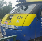
That said I was pretty slackjawed when the new Viewliners came out in Phase 3, then they kept phase 5 for the P42, they they brought out phase something for IDTX... The message I received was "we have so many problems we can't see straight, but we're spending resources and time on choosing colors when we already have a very cohesive identity".
Why couldn't we spend that time on managing service inconsistencies? The utter crap boarding procedures? No, sorry, too busy picking out colors.
The point of a re-brand is to signal a shift in direction of company values or offerings.
In the 60's, we saw vivid new colors like Big Sky Blue, Action Red, Minutemen Blue, Bankruptcy Blue, Red Barons, etc... replacing sleepy earth tones to signal that the railroads were vibrant and forward looking rather than the ancient or backwards organizations the public (and shareholders!) perceived them to be.
Reading introduced the Beeliner brand and Santa Fe introduced the SuperC brand to communicate fast and efficient handling of time-sensative freight that would otherwise go to trucks.
Amtrak introduced Acela to indicate premium-only equipment capable of sustained high speed that will never be in local service.
What did all these mid-2015 color changes signify? Nothing other than wasted time and the same old BS in erratic service levels.
The new Acela: It's not Aveliable.