Railroad Forums 

  • Names and Logos 'n' stuff

  • Pertaining to all railroading subjects, past and present, in New England
Pertaining to all railroading subjects, past and present, in New England

Moderators: MEC407, NHN503

 #1273267  by trainsinmaine
 
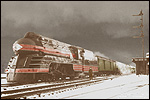
As we know, during the 1950s and '60s there was a tendency among American corporations to alter or change their logos, I presume for the sake of presenting a more modern image to the public. Examples of this would be too numerous to mention. Certainly the trend affected the railroad world; witness the similar McGinnis-inspired logos that appeared on the trains of the Boston and Maine and the New Haven, and the updated version of the New York Central's oval trademark (singularly unattractive in comparison to the famous original, IMHO).

While the modern "NH" font appeared on the New Haven's trains, the original Victorian logo with the words "New York, New Haven and Hartford Railroad Co." was not entirely retired, and was retained on the locomotives. Were the B&M's and NYC's earlier logos completely retired, or did they continue to be used to some extent?

It's a nostalgic nicety to note that the Delaware and Hudson's beautiful longtime logo, dating well back into the 19th century, was never scuttled. To my knowledge, the official name "Delaware and Hudson Canal Company" was retained as well, at least until its sale to the N&W in 1968. Am I correct about that?
 #1273312  by TomNelligan
 
trainsinmaine wrote: While the modern "NH" font appeared on the New Haven's trains, the original Victorian logo with the words "New York, New Haven and Hartford Railroad Co." was not entirely retired, and was retained on the locomotives.
Not quite true. As NH locomotives and rolling stock got repainted from the mid-1950s onward, the McGinnis image normally replaced the older colors and logos. But not everything got repainted during that period, so there was a fair amount of equipment still carrying the old logo at the time of the Penn Central takeover.
Were the B&M's and NYC's earlier logos completely retired, or did they continue to be used to some extent?
The same was basically true on the B&M -- as older equipment was repainted it generally got the McGinnis colors and logo -- with one exception. The Minuteman logo was partially revived during the Alan Dustin administration in the late 1970s/early 1980s period and appeared on the nose of a number of freshly blue painted Geeps, as well as on commuter timetables when the B&M was the contract operator for the MBTA.
 #1274078  by Otto Vondrak
 
trainsinmaine wrote:While the modern "NH" font appeared on the New Haven's trains, the original Victorian logo with the words "New York, New Haven and Hartford Railroad Co." was not entirely retired, and was retained on the locomotives.
The "NH" you refer to is not a "font." The word "font" means a printed sample of a particular typeface. You could call the stylized "NH" a "logo" to be more correct. It was designed by Swiss designer Herbert Matter, and here is a short video clip that shows some of the explorations he took while coming to the final solution for the logo that is so familiar to us.

http://vimeo.com/57203024" onclick="window.open(this.href);return false;

The logo was part of a complete design overhaul for the railroad, from trains to stations to tickets and timetables. You can read the entire detailed history in "The New Haven Railroad in the McGinnis Era" by Marc J. Frattasio:

http://www.whiteriverproductions.com/shopexd.asp?id=41" onclick="window.open(this.href);return false;

Corporate "Style guides" or "graphic standards" are issued to help guide employees and contractors through the transition and instruct in the proper use of a company's logo, typeface, and colors. Of course, it is common to see examples of old and new logos in use while a company is in the process of changing over its image. The change never happens overnight. That is why you still saw some trains carrying old paint and logos long after the new logo was introduced.
Were the B&M's and NYC's earlier logos completely retired, or did they continue to be used to some extent?
What is your definition of "in use?" Again, the idea is that the new logo is the "correct" one, and if you saw the old logo still in use, it means it wasn't replaced or painted over yet. I saw an un-patched Frisco hopper in a freight yard last year, Frisco was acquired by Burlington Northern in 1980. Does that mean the Frisco logo is still "in use?" No, it means for some reason they haven't gotten around to painting a 40-year old freight car (and at this point probably won't unless the car goes in for major repairs or overhaul). On rare occasions, railroads will use vintage or obsolete logos to help enforce copyright (and inspire a bit of company pride), such as Union Pacific's tribute units and Norfolk Southern's heritage units or BNSF's "heritage hoppers."
To my knowledge, the official name "Delaware and Hudson Canal Company" was retained as well, at least until its sale to the N&W in 1968. Am I correct about that?
D&H and Erie Lackawanna were acquired by N&W holding company Dereco, yet there was no significant change to the corporate image of either railroad. With the last commercial load carried on the D&H canal in 1898, the Delaware & Hudson Canal Company dropped the word "canal" from their name in 1899.

D&H and EL aren't New England roads, you might want to ask follow-up questions in their respective forums.

-otto-
 #1274083  by scottychaos
 
Otto Vondrak wrote:
D&H and EL aren't New England roads, you might want to ask follow-up questions in their respective forums.

-otto-
EL definately not..but I think most people would consider the D&H a "New England Road"..
I consider Albany, Troy, Lake George, Ticonderoga, etc. to be part of New England, state borders being irrelevant.
(much like the way Sayre PA is firmly part of the "Southern Tier" (of NY) rail network..2 miles over the state border makes no difference.)
and..the D&H did enter Vermont! ;)
So, it definitely counts as a "New England Road"..

Scot
 #1274432  by highgreen215
 
It wasn't New England originally, but as a stretch could be considered now as CXS - was Chessie the railroad kitten completely retired or is she still a mascot of sorts? My cat, Chessie, would like to know.
 #1274471  by Otto Vondrak
 
highgreen215 wrote:It wasn't New England originally, but as a stretch could be considered now as CXS - was Chessie the railroad kitten completely retired or is she still a mascot of sorts? My cat, Chessie, would like to know.
When a company ceases to exist, then the logo is "retired."

-otto-
 #1274524  by jaymac
 
...until it gets "rehired" to honor heritage...
 #1274526  by ferroequinarchaeologist
 
Going into the wayback machine: early in the 20th century, before the Minuteman, before the square outline, the Boston and Maine herald was an ornate "Boston" above "& Maine" with a vertical upwards-pointing arrow through the capital B. AFAIK, it never appeared on any locomotives or other rolling stock, but only on timetables and advertising stuff.

PBM
Dedicated to the pursuit of meaningless trivia
 #1274564  by Ridgefielder
 
ferroequinarchaeologist wrote:Going into the wayback machine: early in the 20th century, before the Minuteman, before the square outline, the Boston and Maine herald was an ornate "Boston" above "& Maine" with a vertical upwards-pointing arrow through the capital B. AFAIK, it never appeared on any locomotives or other rolling stock, but only on timetables and advertising stuff.

PBM
Dedicated to the pursuit of meaningless trivia
On the same wayback line: I think one of the first, if not the first, herald used on locomotives and rolling stock, as well as printed material, was the New York & New England's Maltese Cross, which dates from the 1880's.

Also, the New Haven's first electric locomotives, ca-1907, had a diamond herald painted on their end doors. I don't know what color it was, nor whether the script "New York, New Haven and Hartford" was inside the diamond.
 #1274691  by Otto Vondrak
 
Graphic design, corporate identity, and the consistent branding of a company are are relatively modern ideas. In the early days of railroading, it was enough to have your name spelled out in fancy script, and maybe add a woodcut illustration of a speeding train or a profile of a locomotive or whathaveyou. Then people began to associate icons and pictures with ideas representing companies, like a cloverleaf, a diamond, a flag, an oval, a keystone, and so on. I'd say railroads were at the forefront of modern advertising techniques as they were the largest corporations around at the turn of the century, and the first to realize the value of good public relations. That's why early pre-1910 railroad "advertising" looks like a mishmash of fillegrees, block type, and spencerian script. A design that was printed on a timetable or some other material might not be the railroad's official "logo" or symbol, and just the construct of some clever small town printer.

-otto-
 #1275006  by ExCon90
 
I read somewhere that that was where the NYC oval came from -- it was something a local printer thought looked nice. The railroad agreed and decided to stay with it.
 #1275467  by Otto Vondrak
 
ExCon90 wrote:I read somewhere that that was where the NYC oval came from -- it was something a local printer thought looked nice. The railroad agreed and decided to stay with it.
That's exactly correct.

-otto-