carajul wrote:I've always wondered who came up with the PC logo? I mean...it's like no effort was put into it. So cheezy. Just "Penn Central" in arial font under a stick figure of a P & C letters. I know the company was a disaster and the board was doing nothing but collecting huge chunks of money. Anyone know who came up with the logo and why such a cheap looking design was put into place?
Hm.
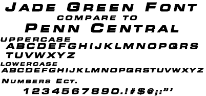
The "font" is not Arial, as you suggest. It is Eurostile Extended Bold Italic.

Arial's letterforms aren't even CLOSE, unless you consider they both contain a "bold" weight. I mean, hold them up side by side...
And to call the interlocking letters "stick figures?" What does that even mean?
I get that you're angry at something Penn Central Corp. did to you, but I think your critique may be a little flawed. Remember, we're looking back through the long telescope of time... This design came about in an era of diversified companies that were looking for simpler, modern logos to enhance their corporate image. Here are the good qualities about the logo:
1) Easy to read and recognize from a distance, able to reproduce cleanly at any size, from 1" to 10' tall. The logo should look good and read well whether it's embroidered on a conductor's lapel, printed on a timetable, applied to the side of a train, or flying on a flag over headquarters.
2) Can be reproduced in corporate color, or in black and white (newspaper ad, tv ads), and still communicate what it is. In other words, it doesn't depend on color to communicate, which, in an era of black and white advertising, was very important. Still true of the best logos today.
3) For a diversified corporation like Penn Central, the logo does not tie it to any one industry. Sure, we know it primarily as a transportation empire, but they were also heavily involved in real estate, energy, and other investments... Not unlike CSX and other modern railroads today.
Is it the prettiest thing in the world? Is it elegant? Attractive? I've never really thought about it that much. It represents the Penn Central Corp., that's all I know. I don't love it or hate it. You want to talk about ambiguous logos? How about the Conrail "can-opener" or the BNSF "swoosh" or CSX's "CSX" letterforms? The trend towards simpler forms and less expressive logos has been a trend for the last fifty years. Would Penn Central have stuck with that logo or maybe tried an evolution of its design had it continued past 1976? Hard to tell... Some logos age well over time, others do not.
-otto-
----------------------------------------------
Moderator: New York State Railfan :: New York Central :: Toy Trains
NYW&B Fan Site ::
A Magazine I Read Often ::
A Museum I Volunteer At