• Color changes to the pinstripes at stations.

  • Discussion of the past and present operations of the Long Island Rail Road.
Discussion of the past and present operations of the Long Island Rail Road.

Moderator: Liquidcamphor

  by MattAmity90
 
A few photos by people have shown that the traditional blue pinstripes that have adorned the platform signs have had their colors changed.

Edward Hand took a photo at the new Elmont station where the pinstripe is now yellow.
Someone else took a photo at Murray Hill where it is now red.

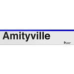
Seems like the pinstripes on the platform signs (except the Port Jefferson/Huntington Branch stations), will change colors to correspond with the branch's color used on the schedules.

I guess this will happen: Babylon goes GREEN, Montauk goes AQUA, Ronkonkoma/Greenport goes PURPLE through Bethpage, Long Beach goes ORANGE, West Hempstead goes CYAN, Far Rockaway goes BROWN, OYSTER BAY goes LIGHT GREEN, Hempstead goes YELLOW, Port Washington goes RED, Port Jefferson/Huntington stays BLUE, and City Terminal Zone goes BLACK or GRAY. I have no idea what the Belmont Park branch will be, but most likely YELLOW?
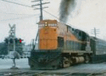
  by R36 Combine Coach
 
MNCR always had color coded station signs. Port Jervis orange, Pascack Valley purple.

The Belmont spur has been dark purple (darker than Ronkonkoma).
  by ExCon90
 
... as well as green, blue, and red for the GCT lines. It makes sense for station signs to be quickly distinguishable from other signs nearby, since that's the first thing a passenger aboard a moving train looks for. A sign outlined in the color associated with the line is easier to spot among the others.
  by MACTRAXX
 
MA90 - A more accurate description to this topic is
"Long Island Rail Road Station Name Sign Topper Color Changes"
These are not - and have never been described as - "pinstripes" on station name signs.

MTA designed (since the early 1970s) LIRR station signs have been black characters on a white reflectorized
background. These signs have used a medium blue topper since the late 1980s replacing the original black.

As a comparison as R36 mentions MNCR station name signs have used a line name color topper since the
middle 1980s which are:
Hudson Line - medium green
Harlem Line - medium blue
New Haven Line - medium red (NYS stations)
Port Jervis Line - orange (NYS stations Suffern to Port Jervis)
Pascack Valley Line - violet (NYS stations Pearl River, Nanuet and Spring Valley only)

The original MTA designed signs used beginning in the early 1970s until 1982 by the Penn Central
Metropolitan Region (became Conrail 4/1/1976) were actually quite interesting...
NYS stations had signs that were black characters on white fiberglass signs with a black topper.

Connecticut station name signs were very different - they were red characters on a white porcelain enamel
sign with a red topper. Some of these signs can be found at NH Line stations still in use - along with more
recent signs with the Connecticut Commuter Rail logo added at CT stations - CCR signs are used on both SLE
and the Hartford-Springfield Line stations.

It would have made perfect sense for the LIRR to use Branch Line timetable color toppers on station name
signs - Port Jefferson Branch stations already use the correct medium blue color as noted - but until these
recently noted changes the LIRR has not followed suit to MNCR to color code signs...One problem could
be stations such as Mineola which is served by multiple branches - an MNCR example as a comparison is
signs used at Harlem-125th Street Station which have a black topper instead of all three GCT line colors.

For the record the LIRR Branch Line colors are (in timetable form number order):
Port Washington Branch - scarlet red
Port Jefferson Branch - medium blue
Ronkonkoma Branch - purple
Oyster Bay Branch - lime green
Hempstead Branch - beige
Far Rockaway Branch - brown
Babylon Branch - aqua green
Long Beach Branch - orange
West Hempstead Branch - light blue
City Terminal Zone - gray
Montauk Branch - teal

MACTRAXX
  by R36 Combine Coach
 
MACTRAXX wrote: โ†‘Thu Feb 10, 2022 7:58 am MTA designed (since the early 1970s) LIRR station signs have been black characters on a white
reflectorized background. These signs have used a medium blue topper since the late 1980s
replacing the original black.

MNCR station name signs have used a line name color topper since the middle 1980s which are:

Port Jervis Line - orange (NYS stations Suffern to Port Jervis)
Pascack Valley Line - violet (NYS stations Pearl River, Nanuet and Spring Valley only)


Connecticut station name signs were very different - they were red characters on a white
porcelain enamel sign with a red topper. Some of these signs can be found at NH Line stations
still in use - along with more recent signs with the Connecticut Commuter Rail logo added at
CT stations CCR signs are used on both SLE and the Hartford-Springfield Line stations.
Suffern is 100% NJT owned and operated, with NJT standard signs (though the platform shed is a MNCR
design). Nearby streets have MNCR station signs. Suffern station and yard are fully NJT (a state agency of
another state owns and operates property in NYS), the NJT/MNCR split seems to be north of Suffern
Yard.

Nanuet has been recently renovated and has red New Haven signs. Blue (Harlem) signs have been spotted at Nanuet and Spring Valley.

ConnDOT signs are of different style than MNCR and actually use the same font as NYCT's subway signs. The Springfield Line has its own design and logo.

I agree with black or grey for LIRR stations with multiple lines, or the signs could have multiple colors for each branch. Mineola could have blue/green/purple, Valley Stream brown, light blue and orange. St. Albans should be dark green, as it really is through Babylon service.
  by MACTRAXX
 
R36 Combine Coach wrote: โ†‘Sat Feb 12, 2022 8:42 pm
MACTRAXX wrote: โ†‘Thu Feb 10, 2022 7:58 am MTA designed (since the early 1970s) LIRR station signs have been black characters on a white
reflectorized background. These signs have used a medium blue topper since the late 1980s
replacing the original black.

MNCR station name signs have used a line name color topper since the middle 1980s which are:

Port Jervis Line - orange (NYS stations Suffern to Port Jervis)
Pascack Valley Line - violet (NYS stations Pearl River, Nanuet and Spring Valley only)


Connecticut station name signs were very different - they were red characters on a white
porcelain enamel sign with a red topper. Some of these signs can be found at NH Line stations
still in use - along with more recent signs with the Connecticut Commuter Rail logo added at
CT stations CCR signs are used on both SLE and the Hartford-Springfield Line stations.
Suffern is 100% NJT owned and operated, with NJT standard signs (though the platform shed is a MNCR
design). Nearby streets have MNCR station signs. Suffern station and yard are fully NJT (a state agency of
another state owns and operates property in NYS), the NJT/MNCR split seems to be north of Suffern
Yard.

Nanuet has been recently renovated and has red New Haven signs. Blue (Harlem) signs have been spotted at Nanuet and Spring Valley.

ConnDOT signs are of different style than MNCR and actually use the same font as NYCT's subway signs. The Springfield Line has its own design and logo.

I agree with black or grey for LIRR stations with multiple lines, or the signs could have multiple colors for each branch. Mineola could have blue/green/purple, Valley Stream brown, light blue and orange. St. Albans should be dark green, as it really is through Babylon service.
R36 - I used Google Streetview to look at the station signs at the mentioned stations..I found:
--Suffern Station has had what looks like ALL of its MNCR signs replaced with NJT signs. The only remaining
MNCR built remnant is the canopy on the southbound side adjacent to the station building. Even the MNCR
information kiosk which was next to the building outside was removed...

All three PVL NYS stations have different colored sign toppers - Pearl River has the violet, Nanuet has BOTH
the "candyapple" red and violet signs visible and Spring Valley has medium blue on two visible name signs.

The CDOT sign pictured at Bethel is a CCR sign - the older porcelain enamel signs have the mentioned MTA
typeface which have slightly different helvetica lettering compared to the CCR signs.

The new Elmont signs have the beige (or mustard) Hempstead Branch color used on the sign toppers there.
Since I have not seen the Murray Hill signs I will abstain from making any comments about them.

Using LIRR Branch Line colors to color-code sign toppers such as the Babylon Branch aqua green would be
a good move - provided that they remain noticeable - some of the porcelain enamel MNCR signs have a sign
topper that is actually separate of the main sign itself - which could help with line identification.
MACTRAXX
  by MACTRAXX
 
Everyone - In the January 2022 Railpace at the top of page 9 there is a clear picture of one of the signs at
Elmont Station with the sign topper stripe in Hempstead Branch beige. The MTA logo and LIRR is noted
in the lower right corner similar to MNCR signs (Andrew Grahl Photo)...It would be interesting to find out
what these signs were manufactured of and if the background white is reflectorized...MACTRAXX
  by Erie-Lackawanna
 
Well as is to be expected of the LIRR, HQ guidance be damned, weโ€™ll create our own artwork for the logo, instead of the official logo artwork readily available on the intranet.

๐Ÿ™„