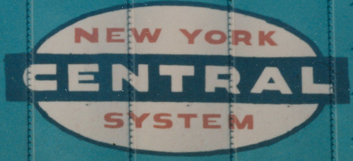
Does anyone know the size and dimensions of a typical NYC logo? Say you wanna make one yourself and need to know the right sizing n placement of the letters. Should look like the photo attached...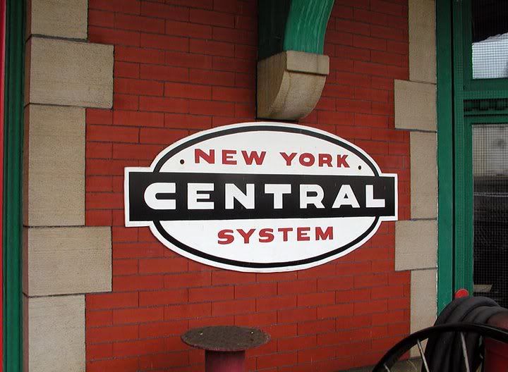
::New York Central::Pennsylvania Railroad::Penn Central::Amtrak::Conrail::Norfolk Southern::CSX::
http://www.youtube.com/user/terminalfan ... ature=mhee
http://www.youtube.com/user/terminalfan ... ature=mhee