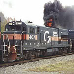
Otto Vondrak wrote:DERECCO wrote:I WAS JUST THINKING AFTER STANDING NEXT TO ONE OF THE NEW GE'S PARKED NEAR THE AMTRAK STATION IN TICONDEROGA THE OTHER DAY HOW NICE IT WOULD BE TO SEE NEW POWER PAINTED IN THE D&H LIGHTNING STRIPE SCHEME. ANY IDEAS ON THE SUBJECT? WOULD CP EVER CONSIDER IT ? IT WOULD BE NICE TO SEE 2 GE'S IN THIS SCHEME!!
Can you not type in all caps? IT'S HARD TO READ AND LOOKS LIKE YOU'RE SHOUTING.
Model railroading is a great hobby, you are free to create whatever you like!
May I point out that before the Geeks Inherited the Earth via WIndows, in Print, CAPS were meant to draw attention for EMPHASIS or were used for people who couldn't SEE VERY WELL, and without an accompanying exclamation point, the use of such print NEVER had ANYTHING to do with YELLING.
YELLING IS DONE WITH CAPS AND UNDERLINED, OR "UNDERSCORED" AS IT HAS COME TO BE CALLED!, the exclamation mark clears any doubt for the reader. Where this nuance was lost over the past twenty years, those of us in print can't figure out. Before the "Paperless" computer age when typewriters had black and red ribbons, with color, many used
RED
CAPS to emphasize yelling, and tagged with an exclamation mark.
I see a lot of "YELLING" online that yields doubt because somebody usually forgets this "!" at the end,and for hundreds of years, it took more than CAPS to determine if someone was yelling or not. The more of these "!!!!!" the louder the yell. You can get an entire document in Caps, people don't yell for very long, so you don't get a lot of underlined copy. You will still get wire copy bulletins in CAPS, and instructional materials in Caps; it's for attention, and still has NOTHING to do with yelling. Where this got confused began when a small handfull of TI techs in Texas RE-WROTE the English language to suit their own lack of understanding it. Lo, I digress --
On the paint schemes, I like it, but to nitpick (hone, finetune, suggest) on the AC unit, I think the bolt would look better making the zig closer beneath the second vent, more to the LEFT. To my eye, it's a little too far to the right. The font would be larger as well, keeping in proportion with the large unit. How many times have we seen a font used on a small locomotive (like an RS-3) put on larger unit, and it just doesn't look right?
On the P-40, it's PERFECT (that was not yelling, that's emphasis without italics!) but I would move the D&H shield to the right of the side door to stretch a good thing out, an additional unit number would fit perfectly beneath the cab side window. Would the D&H have an escape hatch in the nose a la Metro North, or be a repeat of the Amtrak model? As time has progressed, I think D&H would have gone for a thicker font on numerals, perhaps like the NYC font used on the P-40 rear side in the graphic?
Nice graphics, glad people are making them, perhaps we will see one of these in plastic soon??
BRING BACK THE D&H!! That was a JUSTIFIED yell, get the difference?

D/