Railroad Forums 

  • SEPTA Destination Signs

  • Discussion relating to Southeastern Pennsylvania Transportation Authority (Philadelphia Metro Area). Official web site can be found here: www.septa.com. Also including discussion related to the PATCO Speedline rapid transit operated by Delaware River Port Authority. Official web site can be found here: http://www.ridepatco.org/.
Discussion relating to Southeastern Pennsylvania Transportation Authority (Philadelphia Metro Area). Official web site can be found here: www.septa.com. Also including discussion related to the PATCO Speedline rapid transit operated by Delaware River Port Authority. Official web site can be found here: http://www.ridepatco.org/.

Moderator: AlexC

 #1128021  by Malvern Metroliner
 
iamapokemonlegend wrote:i have most of the vintage signs like the R1 West Trenton, R3 West Chester, R6 Ivy Ridge, and R1 Neshaminy Falls. They were given to me as a gift this christmas. all i need to complete my collection is an R5 Parkesburg sign which i have yet to find.
I am missing an R5 Parkesburg as well, along with a few like R2 Baldwin and Charter/Instruction Train.
 #1128064  by iamapokemonlegend
 
i found a charter sign once but it had fallen apart. i am always on the lookout for an R2 Baldwin sign.
 #1129004  by elze68
 
Hi all,

New user here but have been following the community for some time.

I wanted to share my input regarding a previous post about having these signs made: Some time ago I contacted the sign maker, Pannier Graphics, about reproducing the R-signs since SEPTA retired them. The company seemed happy to do so, but contacted SEPTA first to check. In the end, SEPTA said no way, going so far as telling Pannier to tell me I'm not even allowed to see the computer file as it is SEPTA's "art". In reality it makes sense, but they're missing a great opportunity to make a buck.

I also asked why only one sign got the Pannier logo like this: http://www.flickr.com/photos/elze68_sep ... hotostream
SEPTA apparently didn't like the free advertising of Pannier's name.


-Andrew
 #1130155  by degrees83
 
I have contacted pannier too but at least u got a response. i didnt. i didnt know others like u had contacted them too. but i have 2 signs with pannier on them, the r1 u have and r5 bryn mawr,/glenside. i will post that pick shortly. sturday signs tho. i have not seen any other than those two with their logo on it.
 #1130181  by elze68
 
Very interesting. The marketing rep I spoke to said only one sign was made that way, but they probably don't really know or care anymore. And I'm surprised you never got a response - the person I spoke to called and e-mailed me back very quickly with information. I wonder what would happen if more people actively showed interest by contacting them?

Also, does anyone have a photo of or has anyone ever seen one of the Airport signs that managed to squeeze "Center City Philadelphia" all onto one line on the reverse side?
 #1130195  by Matthew Mitchell
 
Never seen that before. My Glenside/R5 Bryn Mawr sign doesn't have it. Maybe it was an identifying mark on the master transparency (I'm guessing they used film for the master and screen-printed the signs, considering the era when they were made). The "Dwg." would certainly be consistent with that.
 #1130204  by elze68
 
Mr. Mitchell, if you get a chance, could you elaborate on the Dwg. lettering and what it's indicative of? I've always been very curious about these signs, considering their nuances in fonts and sizes. It appears that someone was very indecisive as to what would look best, but I have no idea why.
 #1130230  by nomis
 
http://en.wikipedia.org/wiki/.dwg
the simple version would be to go from an [auto]cad file ... screen to machine ... a silk screen machine most likely, to make the lettering for the signs.
 #1130231  by Matthew Mitchell
 
I'm sure there were multiple production runs, in part accounting for the differences in fonts and sizes. SEPTA needed replacements periodically and there were occasional new signs to make.

My guess is that Dwg. stands for "drawing" as in an engineering or architectural drawing: or in this case, whoever composed the master, possibly using 1980s computer technology. A-2726 might be a file number, and B for the back side, maybe? S-1214-11 might be an order number perhaps.

And look at this--here's the company: http://panniergraphics.com/
 #1130419  by skm
 
elze68 wrote:Hi all,

New user here but have been following the community for some time.

I wanted to share my input regarding a previous post about having these signs made: Some time ago I contacted the sign maker, Pannier Graphics, about reproducing the R-signs since SEPTA retired them. The company seemed happy to do so, but contacted SEPTA first to check. In the end, SEPTA said no way, going so far as telling Pannier to tell me I'm not even allowed to see the computer file as it is SEPTA's "art". In reality it makes sense, but they're missing a great opportunity to make a buck.

I also asked why only one sign got the Pannier logo like this: http://www.flickr.com/photos/elze68_sep ... hotostream
SEPTA apparently didn't like the free advertising of Pannier's name.


-Andrew
Would love to see destination magnets
 #1130513  by Malvern Metroliner
 
I have noticed from a variety of signs I have obtained that over the years they varied in color, font, spacing, font size, thickness, and material texture. The oldest ones are thick, solid, non-bendable fiberglass with vibrant colors that fade in sunlight easily. (I have seen sun damaged signs opposed to the one I have). Then, the colors got darker and most fonts were enlarged, causing many signs that used one line for the destination to spell it on two lines.

Signs then became thinner, and after a few reproductions I assume, they became the more flexible signs they used recently- a different variation of fiberglass material or a new material altogether. At first the "R5" was bold and awkwardly spaced making R7 squished together, while R1 had plenty of space in between the R and 1. All of the text was the same size between signs. In the last reproduction they used, the "R5" was on the right of the sign, and fonts varied depending on the size of the destination; "Thorndale" was very small as to fit it on the sign while "Paoli" was huge taking up lots of space.

Then the blue-gray signs were produced on the same flexible material, but each with uniform sizes of the destinations. The new black signs are matte finished, and the font is bolder than the gray and last R signs.

They certainly could not make up their minds and I would not be surprised if they changed producers, even perhaps unbeknownst to Pannier. It would be great if novelty signs could be produced, but I don not know a company capable of recreating these signs until Pannier was mentioned.
 #1130626  by elze68
 
Malvern –

It’s nice to see others have noticed the minute details that evolved from set to set in these signs.
I hope no one minds if I link to a couple more photos to illustrate the differences in signs, including some of what Malvern mentioned: http://www.flickr.com/photos/elze68_sep ... hotostream

Additional small things like the tail piece of the "R" itself show how the fonts were adjusted, even just in helvetica.
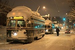
Also, you can distinguish the age of the R style signs from their side markings that identify the routes. The very original ones used upper and lower case lettering, as well as marking the R on both sides, i.e. R6 Ivy Ridge - R6 Norristown, vs newer signs that are written in all caps and say R6 CYNWYD - NORRISTOWN, without the second R6 noted. It appears this may have changed when the commuter tunnel was opened, as the older signs have a MUCH greater frequency of varying sides (i.e. R1 West Trenton/R3 Elwyn, R3 Secane/North Broad, R5 Bryn Mawr/Suburban Station, R2 Baldwin/R3 West Trenton, and so forth). The newer sets eliminated all of these mismatched destinations, but I could be way off base with the tunnel reference - perhaps it was just done for cost efficiency?

Finally, in reference to the much more solid signs that you could really do some damage with: these were likely made on a large sheet and cut to individual boards, much like our paper currency is produced. For anyone who has these older signs, you can look around the borders to see if there is bleeding from other colors (I have several of these I could post photos of). When I spoke to the representative from Pannier, he told me the way the older signs were produced was by essentially laying a paper sticker onto compressed cardboard then rolling fiberglass over top to get the finished product. But if this person was answering my questions, he likely isn't out on the floor making them so this could be inaccurate. Regardless, I find it amazing that this company still has the blueprints to make these, and could do so for collectors, but SEPTA wants no part of it, essentially leaving another small bit of our transit history to rot, albeit much less significantly than real infrastructure.

To nomis and Mr. Mitchell - thanks for your help with what the coding could be. They sound like good answers.
 #1131058  by Malvern Metroliner
 
elze68 wrote:Very interesting. The marketing rep I spoke to said only one sign was made that way, but they probably don't really know or care anymore. And I'm surprised you never got a response - the person I spoke to called and e-mailed me back very quickly with information. I wonder what would happen if more people actively showed interest by contacting them?

Also, does anyone have a photo of or has anyone ever seen one of the Airport signs that managed to squeeze "Center City Philadelphia" all onto one line on the reverse side?
I have actually seen before more than one R1 Airport signs with the Pannier logo. I have not seen any other signs with the logo, but that doesn't mean they don't have them. I bet if you created your own design of a SEPTA sign they would print it for you- I don't think they would have a choice denying a paying customer so long as you created it. I just don't want to see a whole bunch of phony signs circulating around, I like the authenticity of the original signs.
 #1131065  by Matthew Mitchell
 
Malvern Metroliner wrote:I have actually seen before more than one R1 Airport signs with the Pannier logo. I have not seen any other signs with the logo, but that doesn't mean they don't have them. I bet if you created your own design of a SEPTA sign they would print it for you- I don't think they would have a choice denying a paying customer so long as you created it....
They're a private business. They absolutely have a choice [at least for now...] of whether to make a reproduction destination sign for a paying customer.

That's separate from the question of whether SEPTA would be able to bar reproduction by asserting copyright over the design (colors, font, and layout) and/or over the "R-numbers." AFAIK, SEPTA did not register the copyright, but that doesn't necessarily mean they have no right to control the reproduction. Sometimes there are clauses in contracts stating that one party retains all title to designs etc.
 #1131089  by elze68
 
Malvern Metroliner wrote:
I have actually seen before more than one R1 Airport signs with the Pannier logo. I have not seen any other signs with the logo, but that doesn't mean they don't have them. I bet if you created your own design of a SEPTA sign they would print it for you- I don't think they would have a choice denying a paying customer so long as you created it.
I apologize, I should have made what I was saying more clear. I meant the R1 Airport, or Airport R1 sign in general. I have two of them myself, so several were produced with the Pannier logo. I meant that no other R signs were made with this, but degrees83 said their R5 Bryn Mawr sign has it, so perhaps these are just a peculiarity.

I like the idea of creating my "own" design to see what happens. As Mr. Mitchell said, I don't know if SEPTA has a copyright on these designs that would prevent them from being reproduced, but if they do, it would just be a matter of time since SEPTA no longer actively uses them (station signs still sporting the R colors aside). But if SEPTA did assert some sort of ownership, then I only see that a paying customer would have to pay a fee to SEPTA as well as Pannier for the product, unless the folks at 1234 really don't want this happening for some reason.

But Malvern also made a good point that if these were reproduced, the joy of collecting them/having the obscurities would begin to fade away.