Railroad Forums 

  • A&A Conductor Hat Badges

  • All about the Arcade & Attica Railroad
All about the Arcade & Attica Railroad

Moderator: Benjamin Maggi

 #635125  by BSOR Patarak
 
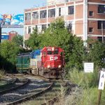
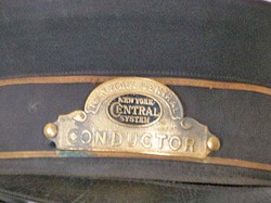
I am looking into the costs to have an Arcade & Attica Conductor hat badge produced. It would be similar to those that many roads had. It would say " Arcade & Attica Railroad" curved across the top in small letters, a round A&A Corporate symbol in orange and then "CONDUCTOR" underneath. I envision one looking like the classic NYC ones. Like the one 2nd down on the right of this page: http://railroadiana.org/badges/pgBadges.php

They would be curved to match the hat and have two screw connectors to fasten them. They'll be of high quality.

Another question would be what symbol to use. I prefer the corporate symbol of the A&A in the orange circle with the passenger train through the center. It has been in use since the beginning of the passenger excursions. Image

My only other thought was there was an earlier A&A type that was just an outline of the letters in an oval pattern. It was used on early passes and a few letterheads.Image It would make it more historic. To my knowledge, the A&A never had any such badges though. I'm leaning towards the orange newer symbol to go along with today's excursions. Your thoughts?

The biggest hang up is the cost of the initial tooling to get them made. Would anyone be interested in purchasing one? The more that are produced, the lower the initial cost. I can see the A&A needing 5 or 6 for their own crews, I'd take a couple. Let me know if there is any interest in this so I can justify the costs involved. If there is enough interest they could also be sold as a fund raiser. Right now, I'm looking at over $110 per copy.
 #635285  by Benjamin Maggi
 
I would be interested in one, perhaps more. It will depend on how my employment status goes...
 #635333  by jgallaway81
 
Let me know what the price is, I'll take at least one. Somehow I managed to lose my "Ticket Agent" badge when started volunteering on the Middletown & Hummelstown.
 #635773  by joesbag
 
Count me in for one. Sounds great!
 #635821  by Mountcastle
 
I can't say I'd have an interest in owning one, myself, but that won't prevent me from offering my two cents with respect to the logo design: the older A&A symbol is more elegant than the current and would, in my opinion, look quite a bit more swank. The design is simple but actually rather sophisticted at the same time. It's got a nice art-deco quality about it, yet there's something evocative of the episcopal about its shape. It hearkens back nicely to the golden days of railroading.

And it would also impart a more exclusive look: it would give the hat the appearance of being a thing truly exclusive to the crew...something that can't just be gotten from anywhere by any old Tom, Dick or Harry.

The regentrification of the coaches might be a good excuse for the restoration of the older, more sophistcated-looking logo (at least as far as the hats go). I'd give serious consideration to making use of it. Save the current logo for the souvenir hats purchased in the gift shop.

It's always nice to see the crew in uniform. I notice that some crew members take more care than others. Whereas some crew seem content to wear a hat with a white shirt and a pair of jeans, still others go to the trouble to present themselves in black (sometimes blue) pressed trousers, waistcoat and tie.

What I never really cared for were the sort of 'varsity' style black and orange jackets with the big logo on the back. The traditional uniforms look so much nicer. I enjoyed this snippet from the web page you referenced:
In the U.S., the practice of requiring uniforms did not begin with railroading but was instituted some time afterwards. In 1888 the Railroad Gazette noted, "The wearing of uniforms has been introduced from England, and is, in the main, a good feature, though some roads whose discipline is otherwise quite good, allow their men to appear in slovenly and even ragged clothes."
A question: if you were to go with the old logo, would it be done in colors? I think it would look sharp to see the 'oval' in black, the 'A&A' in scarlet and the outlining in either gold or silver.
Last edited by Mountcastle on Mon Feb 09, 2009 1:11 pm, edited 2 times in total.
 #635853  by Otto Vondrak
 
I drew this quickly, is this close to what you had in mind? I simplified the ARA logo quite a bit.
Attachments:
A quick drawing of a proposed ARA hat badge
ara_badge.jpg (42.85 KiB) Viewed 7172 times
 #636950  by Benjamin Maggi
 
I would say DON'T use the old image and instead use the "modern" one, if it truly is modern. I think that one features the steam engine pulling the passenger train through the words A & A Railroad looks the best. And, I think that it is the one most people will identify with. Maybe it is too modern, but I think it is the perfect blend of past and present. I would not use the colors that Otto sketched up (no offense Otto) because I think that it should be Gold and Black.

Of course, too many opinions leads to diversification and I am probably good for one badge even if it were made out of cardboard. Of course, throw in a free cab ride and...
 #637549  by Benjamin Maggi
 
Jason,
The picture isn't showing for me, and the link is to a domain name registration site.
 #637996  by BSOR Patarak
 
Those are sort of what I was thinking of. Now take that basic concept and add "Arcade & Attica Railroad" around the symbol, with "Arcade & Attica" curved around across the top and "Railroad" straight across or curved under the symbol. It would be in a smaller black typestyle.

I wonder how it would look with the older A&A symbol in place of the round colored one. Then the pin would only be shiny brass w/black letters, perhaps simple but elegant?
 #638450  by Benjamin Maggi
 
Perhaps. Perhaps not. I still vote for modern logo. I say use it to connect with the railroad that most people know and love... not some railroad in the past that will require much expaining. If you want to bring back the back have it be a seperate button that can be made and sold for a buck or so. Keep the "tradition" which exists from the late 1960s on...
 #639179  by Otto Vondrak
 
Here's an example of a MILW badge:

http://www.antiquemystique.com/images/4572_jpg.jpg

Here's an example of an NYC badge:

http://www.prices4antiques.com/item_ima ... /07-02.jpg